Create Menus with Palette Picker in SwiftUI and UIKit
Use the new palette picker and menu style to display options as rows of compact elements in UIMenu and Menu View in iOS 17.
• 3 min read
Availability
iOS 17
macOS 14
watchOS 10
tvOS 17
Menus are really useful in iOS and iPadOS, they allow to pack many option in a single button in an easy way.
Now, they are even more powerful.
There is a new way to display options in Menu.
It is called Palette and allows you to display multiple items in a row, that can even be scrollable in case the number of items don't fit in the menu.
This option is available in both UIKit and SwiftUI but with a slightly different approach.
Palette picker SwiftUI
In SwiftUI, the palette options must be applied to a Picker view and the picker must be added inside a Menu.
This way the picker will be shown in a row of the menu.
Menu("Options") {
  Button("Remove tag") { }

  Picker("Tags", selection: $selection) {
    ForEach(Tag.allCases, id: \.self) { tag in
      Image(systemName: "circle.fill")
        .tint(tag.color)
        .tag(tag)
    }
  }
  .pickerStyle(.palette)
}
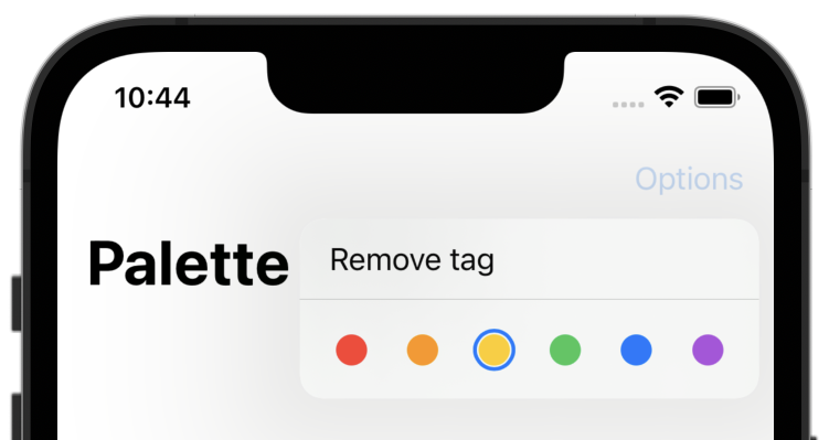
This will result in the following menu.
Note
If you apply the .segmented picker style to a Picker that is placed outside of a Menu, it will behaved like the .segmented style.
UIMenu palette UIKit
In UIKit, to create a palette menu, add to the options parameter of the UIMenu, the .displayAsPalette and .displayInline options.
let tagOptions = Tag.allCases.map { tag in
  let image = UIImage(systemName: "circle.fill")?.withTintColor(tag.color, renderingMode: .alwaysOriginal)
  return UIAction(image: image) { _ in }
}

let tagMenu = UIMenu(options: [.displayInline, .displayAsPalette],
                     children: tagOptions)

let menu = UIMenu(children: [
  UIAction(title: "Remove tag") { _ in },
  tagMenu
])
The result is the same as for the SwiftUI approach.
Palette selection effect
SwiftUI offers also the possibility to customise the selection effect really easily.
You just need to use the .paletteSelectionEffect modifier on your picker and choose one of these options.
automatic, shows a blue outline around selected itemscustom, lets you implement your own selection effectsymbolVariant, applies a variant of the SF Symbol used
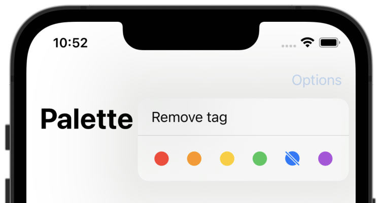
Custom selection effect
This selection effect lets you choose which element to display for the selected item.
Picker("Tags", selection: $selection) {
  ForEach(Tag.allCases, id: \.self) { tag in
    // 1.
    Image(systemName: selection == tag ? "circle.slash.fill" : "circle.fill")
      .tint(tag.color)
      .tag(tag)
  }
}
.pickerStyle(.palette)
// 2.
.paletteSelectionEffect(.custom)
- Change the image whether the current tag is selected
- Set the selection effect modifier to
custom
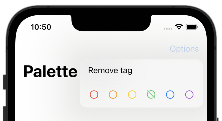
Symbol variant selection effect
The variant selection effect can only be used with SF Symbols.
It applies a variant of the base symbol.
E.g. if you set the property of .symbolVariant to .slash, the circle symbol will be replaced by the circle.slash symbol when it is selected.
Picker("Tags", selection: $selection) {
  ForEach(Tag.allCases, id: \.self) { tag in
    Image(systemName: "circle")
      .tint(tag.color)
      .tag(tag)
  }
}
.pickerStyle(.palette)
// 1.
.paletteSelectionEffect(.symbolVariant(.slash))
- Set the selection effect modifier to
symbolVariant(.slash). This way, the selected tag image will be replaced with the slashed version if available.
Warning
Not every SF Symbol has a corresponding variant.
Complete code on GitHub
Check out the complete code here.
If you have any question about this article, feel free to email me or tweet me @franceleonidev and share your opinion.
Thank you for reading and see you in the next article!
Share this article